Wambo: A Bold Display Font for Confident Digital Headlines
Last week, I was finalizing the hero section of a new landing page for a creative coaching practice — clean layout, warm photography, and a strong message about clarity and growth. But something felt off in the headline. The current sans serif was legible, yes, but it didn’t carry the weight the brand deserved. That’s when I dropped Wambo into the mockup — and everything clicked.
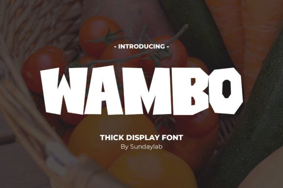
Wambo is a thick, high-impact display font with serious presence. It’s not subtle. It’s not meant to blend in. Its bold strokes, tight spacing, and confident rhythm make it feel like a statement — one that says “this matters” before the user reads a single word. As a display font, it lives where attention is earned: hero banners, section headers, logo lockups, and campaign graphics. It’s built for impact, not paragraphs.
I tested Wambo across devices — desktop, tablet, and mobile — and found it holds up remarkably well at larger sizes. At 48px on desktop and 36px on mobile (with appropriate line-height and letter-spacing), it remains crisp and authoritative. On dark backgrounds, its weight adds gravitas; over light image overlays, it stays legible without needing heavy text shadows. Just avoid using it below 28px — it starts to lose definition, especially on lower-DPI screens.
What makes Wambo especially useful in real web projects is how it shapes visual hierarchy. On a course sales page, pairing Wambo for the main headline (“Build Your First Digital Brand”) with a clean, neutral sans serif like Inter or Manrope for body copy creates instant contrast and direction. The eye lands first on the bold statement, then flows naturally into supporting details. No extra animations or scroll effects needed — just smart typography doing its job.
It’s also proven effective in boutique online store banners. Think of a small ceramics shop launching a seasonal collection: “Summer Glaze” in Wambo over a soft-focus photo of hand-thrown mugs. The font doesn’t compete with the imagery — it anchors it. Same goes for portfolio homepages where designers want their name or tagline to feel like a signature, not just text.
That said, Wambo isn’t meant for navigation menus, form labels, or paragraph text. Its personality is too strong for functional UI elements. I’ve seen it misused in buttons — too heavy, too dominant — and while it *can* work in large CTA buttons (“Start Your Journey”), it’s far more effective as a headline paired with a lighter, highly legible typeface for the supporting action.
Font pairing is where Wambo shines brightest. Because it’s a PUA-encoded display font, it includes stylistic alternates and consistent glyph coverage — helpful if you’re designing digital brand kits or social media templates that need typographic consistency across platforms. I paired it with a relaxed geometric sans for body copy and a subtle serif for pull quotes on a blog redesign, and the balance felt both modern and intentional.
Before dropping Wambo into any live project, I always check three things: webfont availability (WOFF2 is ideal for speed), licensing scope (commercial use, client projects, and template resale rights matter), and fallback behavior. Since Wambo is a display font, your CSS stack should gracefully degrade — e.g., font-family: "Wambo", -apple-system, BlinkMacSystemFont, "Segoe UI", sans-serif;. That way, if the font fails to load, the hierarchy still holds.
One thing I appreciate about Wambo is how it supports brand trust through consistency. On a coaching website, for example, using the same bold treatment for section headers (“Your Process”, “What You’ll Gain”, “Next Steps”) builds rhythm and reliability. Users subconsciously register that repetition as professionalism — not decoration. It’s typography as quiet confidence.
It’s also worth noting how Wambo behaves in fast-loading contexts. Because it’s a single-weight display font (not a full variable family), file size stays lean — critical for performance-focused sites. No need to load multiple weights unless you’re using alternates intentionally. And since it’s designed for short-form impact, you won’t be loading it for long blocks of text anyway.
In editorial layouts — like a redesigned newsletter or content hub — I’ve used Wambo sparingly but strategically: only for featured article titles or chapter breaks. Overuse dilutes its power. Think of it like a spotlight: most of the stage stays softly lit, but key moments get full focus.
For digital ads and social banners, Wambo scales cleanly across formats. I used it in a carousel ad series for a SaaS onboarding course — each slide had a different benefit headline (“Clarity”, “Control”, “Confidence”) in Wambo, all aligned to the same baseline and spacing. The consistency made the sequence feel cohesive, even without shared imagery.
If you're evaluating Wambo for your next project, ask yourself: where does your brand need to stand out *first*? Not everywhere — just where it counts. A hero headline. A logo lockup. A campaign banner. A product name on a packaging mockup. That’s Wambo’s territory. It’s not background music — it’s the opening chord.
And because it’s a premium display font built for digital clarity, not just print flourish, it respects the constraints of the web: responsive behavior, accessibility considerations (when used at appropriate sizes and contrast), and cross-browser rendering. Just remember to test it early — not just in Figma, but in actual browser previews with real content and real device widths.
Typography is one of the few design tools that communicates tone before a single interaction happens. With Wambo, that tone is bold, grounded, and unmistakably human. Not flashy — focused. Not loud — authoritative. In a world of endless scrolling and shrinking attention, sometimes the strongest design decision is the one that simply refuses to be ignored.