Lumiere: A Playful Display Font That Lifts Digital Headlines
It started with a hero section. I was refreshing the homepage for a small creative coaching brand—clean layout, warm photography, soft color palette—and the headline just felt… quiet. Too safe. So I swapped in Lumiere, set it at 48px on desktop and 36px on mobile, and watched the whole section exhale. Suddenly, the message wasn’t just seen—it was felt. That’s Lumiere’s quiet magic: it doesn’t shout, but it absolutely commands attention with charm and intention.
What Lumiere Brings to the Screen
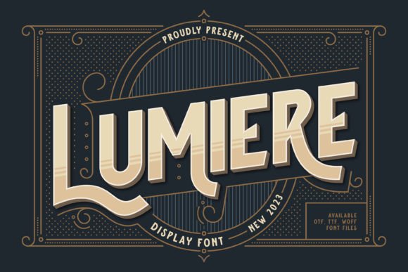
Lumiere is a display font built for moments that matter—not for paragraphs, but for presence. Its letterforms balance rounded friendliness with subtle asymmetry: think soft curves on the ‘a’ and ‘g’, a gently tilted crossbar on the ‘e’, and just enough quirk in the uppercase ‘Q’ to make you smile. It’s not cartoonish, not overly decorative—but undeniably *alive*. In web design terms, it’s a personality amplifier: perfect for brands that want warmth without sacrificing polish, playfulness without losing professionalism.
I tested it across real scenarios: a boutique online store’s seasonal banner (“Spring Collection Is Here!”), a course landing page’s main CTA (“Start Your Creative Journey”), and a portfolio site’s project title overlay on a muted background image. In every case, Lumiere added visual rhythm and emotional resonance—without competing with content or confusing hierarchy.
How It Performs in Responsive Layouts
Here’s what surprised me: Lumiere holds up beautifully at smaller sizes—when used intentionally. At 28–32px on mobile, it remains legible and expressive, especially over light or softly blurred backgrounds. I paired it with a neutral sans serif (Inter, loaded via Google Fonts) for body copy, and the contrast created instant breathing room: Lumiere for voice, Inter for clarity.
Where it shines most is in hero sections, section headers, and call-to-action buttons (as display text only—not button labels under 16px). On a recent blog redesign, I used Lumiere for post titles in the featured grid—large enough to read at a glance, distinctive enough to encourage clicks. No rendering hiccups, no FOIT delays when self-hosting the WOFF2 files. The font loads cleanly, even on slower connections, as long as you serve it with proper font-display: swap.
Smart Pairings & Practical Pairing Advice
Lumiere isn’t meant to stand alone. It thrives in conversation—with type that grounds it. My go-to pairings:
- A clean, highly legible sans serif (like Inter, Poppins, or Work Sans) for all body text, navigation, forms, and captions—this keeps UX friction low and accessibility high.
- A gentle serif (such as Cormorant Garamond or Lora) for editorial-style sites where you want elevated tone—think coaching blogs or creative studio sites with long-form storytelling.
- A restrained script (only as an accent, like for “handwritten” quote pulls or signature lines)—but never alongside Lumiere in the same headline. Too much personality in one place dilutes impact.
Crucially, avoid using Lumiere for anything requiring dense readability: form fields, error messages, table headers, or mobile menu items. Its charm lives in brevity and emphasis—not utility.
Real-World Testing: What Worked (and What Didn’t)
In a product landing page for a digital brand kit, I used Lumiere for the main headline (“Your Brand, Brighter”) and subhead (“A curated collection of fonts, palettes & templates”). It worked brilliantly—scannable, memorable, aligned with the joyful brand voice. But when I tried it for feature bullet points (“Drag-and-drop layouts”, “Print-ready PDFs”, “SVG + PNG assets”), the charm turned into clutter. Swapped those out for a crisp sans serif—and the page instantly felt more trustworthy and actionable.
For dark-mode interfaces? Lumiere performs well—just ensure sufficient contrast (I tested against #1a1a1a backgrounds with white or soft cream text). Avoid thin weights on dark UIs unless you’re certain of your contrast ratios. And always preview on actual devices: that delicate ‘t’ crossbar? Gorgeous on retina screens, slightly fragile at 18px on older Android browsers—so stick to 24px minimum for any interactive or critical text.
Licensing, Formats & What to Check Before You Launch
Before dropping Lumiere into a client site or your own shop, verify three things: First, that the license covers web use (not just desktop)—many display fonts require a separate webfont license. Second, confirm it includes WOFF2 (smaller file size, broader browser support) and ideally variable font options if you plan fine-tuned weight control. Third, scan for multilingual support—if your audience includes European languages, check whether accented characters (é, ñ, ü) render cleanly.
The version I used included OpenType features—ligatures and stylistic alternates—which added subtle polish to headlines (like the connected ‘f’ + ‘i’ combo). Not essential, but lovely for premium-feeling touches. And yes—it’s a commercial font, so if you’re bundling it into a Figma template or selling branded website kits, double-check the license permits redistribution.
Lumiere won’t solve weak copy or poor layout—but in the right context, it elevates both. It’s the kind of display font that reminds you typography is part of the user experience, not just decoration. When your headline needs to feel human, hopeful, and quietly confident? Lumiere doesn’t just fit—it fits right.