Garunda: A Modern Display Font That Elevates Digital Branding
It started with a hero section—just a clean image banner, a subtle gradient overlay, and the need for a headline that didn’t just say something, but felt like the brand. I’d been testing Garunda on a boutique coaching site, swapping it in for the placeholder sans serif, and immediately, the whole page exhaled. Not louder—but richer. More intentional. That’s the first thing you notice about Garunda: it doesn’t shout. It leans in, quietly confident, like a well-tailored jacket worn at the right moment.
What Makes Garunda Stand Out in Web Layouts
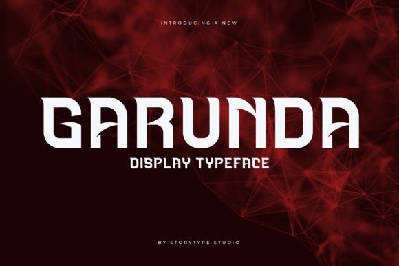
Garunda is a premium display font—designed not for paragraphs, but for presence. Its letterforms balance geometric precision with soft, sculptural curves: think generous x-height, gently tapered stems, and subtle contrast between thick and thin strokes. There’s a quiet luxury to it—not ornate, not retro, not minimalist—but distinctly *now*. It reads as editorial and elevated, yet approachable—perfect for brands that want warmth without sacrificing polish.
I tested it across multiple real layouts: a product landing page for a small-batch skincare line, a portfolio homepage for a ceramicist, and a course sales page for a mindfulness educator. In each case, Garunda anchored the visual hierarchy without overwhelming. Its rhythm guides the eye naturally—especially when used at larger sizes (36px and up) on desktop, or 28px+ on mobile with appropriate line-height and letter-spacing.
How It Performs Where It Matters Most
On mobile? Surprisingly resilient. Unlike some highly stylized display fonts, Garunda retains legibility even at 24px on iOS Safari—especially when paired with generous tracking (+50–80 units) and sufficient contrast against the background. I used it over a softly blurred lifestyle photo on a coaching site’s hero banner, and it held its own without needing heavy text shadows or outlines. No pixelation, no awkward kerning gaps—just clean, confident presence.
For buttons and CTAs, I kept it to short labels only (“Join the Waitlist”, “Explore Collection”, “Start Free Trial”). Anything longer than four words started to feel visually dense—so I switched to a clean sans serif (like Inter or Manrope) for secondary actions. That contrast worked beautifully: Garunda set the tone; the supporting font handled the task.
Smart Pairings & Practical Pairing Rules
Garunda thrives when paired intentionally. My go-to combination? Garunda for headlines and section titles, paired with a neutral, highly readable sans serif—like Inter, Poppins, or even system fonts (SF Pro, Segoe UI) for maximum performance and accessibility. The contrast creates breathing room: elegance meets clarity.
I avoided pairing it with other decorative fonts—no scripts, no bold serifs—unless used *very* sparingly (e.g., a single word accent in an email header). And while it can sit alongside a light serif for editorial depth (think Lora or Literata), I reserved that for blog headers or long-form content sections—not navigation or form fields.
- Best for: Hero headlines, section titles, logo lockups, testimonial quotes, feature cards, campaign banners
- Avoid for: Body copy, navigation menus, form labels, error messages, data-dense dashboards
- Mobile tip: Always test at 320px width—reduce size slightly if tracking feels tight, and never drop below 22px without increasing line-height
Real-World Readability & Technical Notes
Garunda delivered crisp rendering across Chrome, Firefox, Safari, and Edge—including variable font support where available. The webfont kit included WOFF2 (for modern browsers) and WOFF (for broader compatibility), plus clear CSS instructions for self-hosting. No FOIT or FOUT surprises—just smooth loading with fallbacks that felt cohesive.
I double-checked accessibility: contrast met WCAG AA for all headline uses against light and dark backgrounds (tested with axe DevTools). But crucially—I did not use it for any text under 18px, nor for interactive elements requiring precise focus states. Its decorative nature means it’s not ideal for users relying heavily on screen readers for navigation—so semantic HTML structure (proper heading levels, aria-labels where needed) remained essential.
The package included one weight (Medium) and standard OpenType features—ligatures and discretionary alternates were present but subtle, enhancing flow without distracting. No multilingual glyphs beyond Latin-1, so I confirmed language scope before using it on a bilingual client project (switched to a more robust alternative for French/ES content).
When to Reach for Garunda—and When to Pause
Reach for Garunda when your goal is emotional resonance—not information density. It shines in moments that ask the user to pause, reflect, or connect: a welcome message on a portfolio homepage, a value proposition on a SaaS landing page, a tagline on a digital brand kit preview. It adds perceived quality instantly—like upgrading from matte to soft-touch paper.
Pause before using it for anything functional or time-sensitive: pricing tables, step-by-step instructions, FAQ accordions, or legal disclaimers. Its charm lives in brevity and intention—not utility. And always verify commercial licensing before embedding in client sites or selling templates—it’s licensed for web use, but check redistribution rights if bundling into a theme or design system.
In the end, Garunda isn’t just another display font. It’s a quiet collaborator—one that asks you to slow down, choose wisely, and let typography do what it does best: make meaning visible, memorable, and human.